Modern themes for Tkinter. Sleek, responsive styles inspired by Bootstrap. Includes ready-to-use widgets, 20+ themes, and tools for building beautiful, cross-platform desktop apps with ease.
pip install ttkbootstrap



ttkbootstrap
Modern, themed tkinter — style any ttk widget with one keyword.
ttkbootstrap is a theming extension for tkinter. It generates flat,
Bootstrap-inspired light and dark themes on demand and adds a single bootstyle
keyword to every ttk widget, so you describe intent — "primary",
"success", "outline" — instead of hand-tuning colors or long ttk style
names.
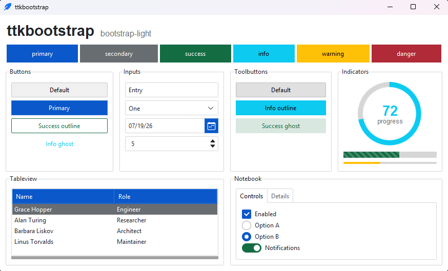
Why ttkbootstrap
- 🎨 30 curated themes — fifteen families, each in a coordinated light and dark variant, that switch at runtime.
- ⌨️ One-keyword styling —
bootstyle="success",bootstyle="info outline",bootstyle="round toggle". The same keyword means the same thing on every widget. - 🧩 Batteries-included — styled ttk widgets plus a few extras (
Meter,DateEntry,Floodgauge,Tableview) and fully themed dialogs. - 🛠️ Your own themes & styles — a declarative
Theme(...)API and a public toolkit for building custom widget styles. - 🪶 Pure Python — one dependency (Pillow), Python 3.10+, no native extensions.
It's a styling layer for vanilla tkinter, not a new framework: the widgets stay tkinter's, and everything you already know about tkinter still applies.
Install
python -m pip install ttkbootstrap
Quickstart
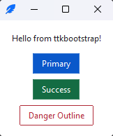
import ttkbootstrap as ttk

app = ttk.App(title="Hello")

ttk.Label(app, text="Hello from ttkbootstrap!").pack(padx=16, pady=(16, 8))
ttk.Button(app, text="Primary", bootstyle="primary").pack(padx=16, pady=4)
ttk.Button(app, text="Success", bootstyle="success").pack(padx=16, pady=4)
ttk.Button(app, text="Danger Outline", bootstyle="danger outline").pack(padx=16, pady=(4, 16))

app.mainloop()
The bootstyle keyword
A bootstyle value is a small grammar — a color, plus an optional modifier
and widget type — and the same keyword carries the same meaning across widgets:
ttk.Button(app, bootstyle="success")
ttk.Progressbar(app, bootstyle="success")
ttk.Entry(app, bootstyle="success")
Add a modifier or a type for variants: "info outline", "success round toggle",
"warning striped". The vocabulary is closed, so a typo fails loudly instead of
silently doing nothing. See the
bootstyle grammar
for the full reference.
Themes
Thirty curated light and dark themes, switchable at runtime:
app.theme_use("bootstrap-dark")   # any theme by name
app.toggle_theme()                # flip light <-> dark
Browse them in the themes gallery.
Documentation
- Documentation — guides, the widget catalog, and the API reference.
- Build your first app — a step-by-step walkthrough.
- Migrating to 2.0 — upgrading from 1.x.
- Release notes — what changed in each version.
Upgrading from 1.x
2.0 is a cleanup-and-consolidation release with some breaking changes — a canonical
bootstyle grammar, a new theme catalog, and App alongside Window. Most code
keeps working: legacy theme names and older spellings are accepted with a
deprecation warning. The
Migrating to 2.0
guide sorts every change into breaking / deprecated / notable / new.
Icons
ttkbootstrap ships with the full Bootstrap Icons
set (2,000+ glyphs), rendered from a bundled font — theme-following, crisp at any
size, and no extra dependency. Add one with the icon= keyword:
ttk.Button(app, text="Settings", icon="gear-fill", bootstyle="primary")
Need other icon families — Font Awesome, Material, Lucide, and more? The ttkbootstrap-icons extension is still available and adds installable icon providers alongside the built-in set.
Contributing
Contributions are welcome — please check out our contributing guidelines.
Support
This project is proudly developed with the support of the PyCharm IDE, generously provided by JetBrains.
© 2025 JetBrains s.r.o. JetBrains and the JetBrains logo are registered trademarks of JetBrains s.r.o.